In today’s fast-paced digital world, WordPress developers are expected to build visually cohesive websites that scale across projects. But without a standardized approach, inconsistencies creep in—causing extra rework and bloated codebases.
This is where design systems shine. By combining reusable UI components, rules, and tokens, design systems help WordPress teams deliver consistent, high-quality experiences—faster.
Whether you’re a solo freelancer or part of a large agency, building a design system tailored for WordPress is one of the best long-term investments you can make in your workflow.
What Is a Design System?
A design system is a collection of reusable design elements—like colors, typography, spacing, and UI components—combined with rules for how they should be used.
Famous examples include:
- Material Design by Google
- Carbon Design System by IBM
In the WordPress world, this translates to:
- Shared Gutenberg blocks
- Global theme styles
- Reusable design tokens
Why Design Systems Matter in WordPress
WordPress is inherently modular—making it perfect for design systems. With dozens of themes and plugins often powering a single site, having a system ensures:
- Visual consistency across pages and components
- Faster development through reusable assets
- Better collaboration between design and dev teams
Building a WordPress Design System from Scratch
To create a design system that integrates with WordPress, you’ll need to define:
- Design Tokens (colors, fonts, spacing)
- Base Styles (buttons, headings, links)
- Component Library (cards, CTAs, sliders)
- Usage Guidelines (when and how to use components)
You can store these styles in your theme.json for Gutenberg or define them in a SCSS/Tailwind config file for classic themes.
Using theme.json for Global Styles
The theme.json file is a powerful tool introduced in Full Site Editing (FSE). It allows theme developers to define:
- Font sizes
- Color palettes
- Layout spacing
- Block settings
Example:
{
  "settings": {
    "color": {
      "palette": [
        { "name": "Primary", "slug": "primary", "color": "#1a73e8" }
      ]
    },
    "typography": {
      "fontSizes": [
        { "name": "Large", "slug": "large", "size": "2rem" }
      ]
    }
  }
}
Syncing Design with Tools like Figma or Storybook
To bridge design and code:
- Use Figma Tokens plugin to export design tokens to JSON
- Import those tokens into your
theme.jsonor CSS framework - Use Storybook to document and preview reusable block components
This approach makes it easy for teams to scale, audit, and maintain visual consistency—even across multiple WordPress installations.
Shared Design Token in SCSS
$primary-color: #1a73e8;
$border-radius: 0.5rem;

.button {
  background-color: $primary-color;
  border-radius: $border-radius;
}
theme.json: Define and Reuse Colors and Fonts
{
  "settings": {
    "color": {
      "custom": false,
      "palette": [
        { "name": "Brand Blue", "slug": "brand-blue", "color": "#0073aa" }
      ]
    },
    "typography": {
      "fontFamilies": [
        {
          "fontFamily": "'Inter', sans-serif",
          "slug": "inter",
          "name": "Inter"
        }
      ]
    }
  }
}
Register a Custom Block Using Design Tokens
register_block_type( __DIR__ . '/blocks/cta', array(
    'style' => 'theme-style',
    'editor_style' => 'editor-style'
) );
Best Practices
1. Start with Design Tokens
Define base tokens first (colors, spacing, typography), then layer components and blocks.
2. Document Everything
Maintain a style guide using:
- A Git-based markdown documentation site
- Storybook for React-based components
- Pattern libraries for block previews
3. Modularize Blocks
Break down your custom blocks into reusable pieces (e.g., buttons, cards, icons) and follow naming conventions (c-button, c-card).
4. Version and Audit Regularly
Keep your design system in version control. Use changelogs to communicate updates clearly to your team.
5. Empower Designers and Developers
Ensure both design and dev teams can contribute to the system. Use shared language and cross-discipline workflows.
Conclusion
Design systems bring clarity, speed, and consistency to WordPress development. They reduce technical debt, improve collaboration, and make your UI more scalable.
In the age of Full Site Editing and component-driven development, the time to adopt a design system in your WordPress workflow is now.
By aligning your design and code under a single system, you set a solid foundation for future growth across any number of sites.
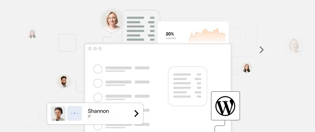
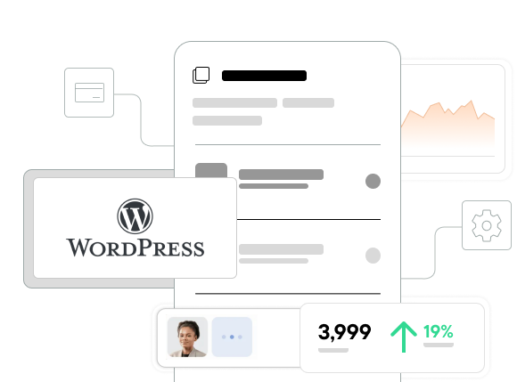
How Sitebox Helps Standardize Design Systems Across WordPress Projects
Sitebox is purpose-built for modern WordPress teams that prioritize consistency and efficiency. With Sitebox, you get:
- Centralized design token management
- Component syncing between Figma and code
- Block-based starter themes using your design system
- Version-controlled theme.json integration
- Built-in Storybook-style documentation for custom blocks
Whether you’re building for clients or managing a multisite network, Sitebox ensures your design system is enforced at every layer—UI, code, and deployment.