Mobile Optimization for WordPress is no longer optional—it’s essential. With over 60% of web traffic now coming from mobile devices, ensuring your WordPress site performs flawlessly on smartphones and tablets is critical for both user experience and SEO.
Slow load times, broken layouts, and hard-to-use navigation can drive mobile visitors away—and Google penalizes sites that don’t meet its mobile usability standards.
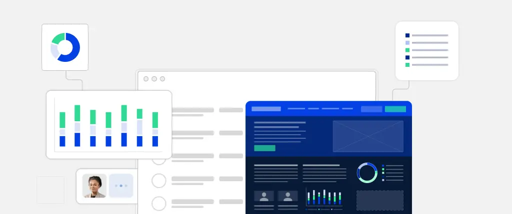
That’s where SiteBox comes in. This guide outlines best practices for Mobile Optimization for WordPress and shows how SiteBox simplifies every step of the process.
1. Start with a Mobile-Friendly WordPress Theme
The foundation of any mobile-optimized website is a responsive, lightweight theme that automatically adapts to any screen size.
✅ How SiteBox Helps:
- Pre-optimized responsive themes – Every SiteBox layout adjusts fluidly on mobile screens.
- Mobile preview mode – See real-time views of your site on various devices.
- Streamlined codebase – SiteBox themes remove bloated code and unnecessary libraries.
2. Automate CSS & Media Query Optimization
Even if your theme isn’t perfect out of the box, CSS media queries can help you adjust styling for mobile screens.
✅ How SiteBox Helps:
- Smart CSS optimization – Removes unused styles and serves mobile-specific CSS.
- Dynamic media queries – Automatically adjusts layouts for devices from 320px and up.
Example: Scalable Images with CSS
img {
  max-width: 100%;
  height: auto;
}
This ensures images scale properly on smaller screens, avoiding layout breakage.
3. Image Optimization for Mobile Performance
Images are often the largest files loaded on a page. On mobile, they can significantly impact speed and bandwidth.
✅ How SiteBox Helps:
- Automatic image compression – Shrinks file sizes without losing quality.
- WebP format conversion – Modern, lightweight image format that loads faster.
- Lazy loading built-in – Loads images only when users scroll to them.
4. Caching and CDN for Faster Mobile Loading
Mobile users expect pages to load within 2–3 seconds. Slow sites lead to higher bounce rates and lower conversions.
✅ How SiteBox Helps:
- Integrated caching – Stores and serves content faster for repeat visitors.
- Built-in CDN (Content Delivery Network) – Delivers content from servers closest to the user.
- Minification of CSS/JS – Removes whitespace and compresses code.
Example: WordPress Asset Optimization
function optimize_assets() {
    wp_enqueue_style('style', get_stylesheet_uri(), [], null);
    wp_enqueue_script('script', get_template_directory_uri() . '/js/script.js', [], null, true);
}
add_action('wp_enqueue_scripts', 'optimize_assets');
This ensures scripts are loaded efficiently and only when needed.
5. Optimized Mobile Navigation and Menus
Good mobile navigation helps users browse your site comfortably, especially with one hand. Menus should be easy to access and responsive to touch.
✅ How SiteBox Helps:
- Responsive mobile menus – Automatically collapses and converts menus on small screens.
- Touch-optimized navigation – Includes swipe gestures, hamburger menus, and dropdow
Example: Basic Mobile Navigation CSS
.nav-menu {
  display: flex;
  flex-direction: column;
}

@media (max-width: 768px) {
  .nav-menu {
    display: none;
  }
  .mobile-menu {
    display: block;
  }
}
6. Mobile-Friendly Forms
Forms are key for conversions—but they’re often hard to use on mobile devices if not designed properly.
✅ How SiteBox Helps:
- Touch-friendly form elements – Proper spacing and larger tap targets.
- Autocomplete and autofill – Speeds up checkout and contact form completion.
- Validation and error handling – Ensures smoother form submission on mobile.
Example: Email Input Field
<input type="email" name="email" autocomplete="email" autocorrect="off" required>7. Mobile-First SEO and Google Ranking Factors
Google’s Mobile-First Indexing means that the mobile version of your website is the one that matters most for rankings.
✅ How SiteBox Helps:
- Built-in mobile usability testing – Ensures your site passes Google’s mobile checks.
- Typography scaling – Automatically adjusts font sizes for readability.
- No intrusive interstitials – SiteBox popups comply with Google’s guidelines.
SiteBox: The All-in-One Mobile Optimization Platform for WordPress
Most optimization tasks require plugins or developers—but SiteBox handles everything in one platform.
🚀 Key Benefits of Using SiteBox:
- Responsive themes built for mobile
- Optimized image delivery via WebP and lazy loading
- Minified CSS/JS and integrated caching
- Mobile-first SEO tools
- User-friendly navigation and forms
- No plugin overload or compatibility issues
Best Practices Summary: Mobile Optimization for WordPress with SiteBox
| Practice | How SiteBox Helps |
|---|---|
| ✅ Responsive design | Built-in mobile themes |
| ✅ Optimized images | Compression, WebP, lazy loading |
| ✅ Speed | CDN + caching + code minification |
| ✅ Navigation | Mobile menus and gestures |
| ✅ Forms | Touch-friendly, fast, and error-free |
| ✅ SEO | Google-compliant design and speed |
Conclusion: Future-Proof Your WordPress Site with Mobile Optimization
In today’s mobile-first world, optimizing your WordPress site for mobile users is non-negotiable. Poor mobile performance hurts your SEO, damages user experience, and costs you conversions.
With SiteBox, you don’t need to be a developer or install dozens of plugins. From mobile themes to image compression, lazy loading, and SEO—SiteBox automates it all.
🚀 Ready to optimize your WordPress site for mobile?
👉 Try SiteBox today and deliver a blazing-fast mobile experience to every visitor.