The last decade or so has seen a seismic digital shift for financial services.
Since the boom of fintech companies, payment providers and neobanks competing in the space with traditional fund houses, banks and asset and investment managers, each part of the wider industry has upped its game in creating exceptional websites to suit their user base.
Showcasing brand identity, hosting a range of informative content and creating investor portals makes up some of the web content we often see, but also interactive widgets, app download buttons and cutting-edge graphics are implemented to drive web visitors toward the service they are looking for.
We’ve delved into the full range of the finance world to find 10 exemplary web offerings that can provide inspiration for performant, UX-driven website experiences for financial services.
Accuro
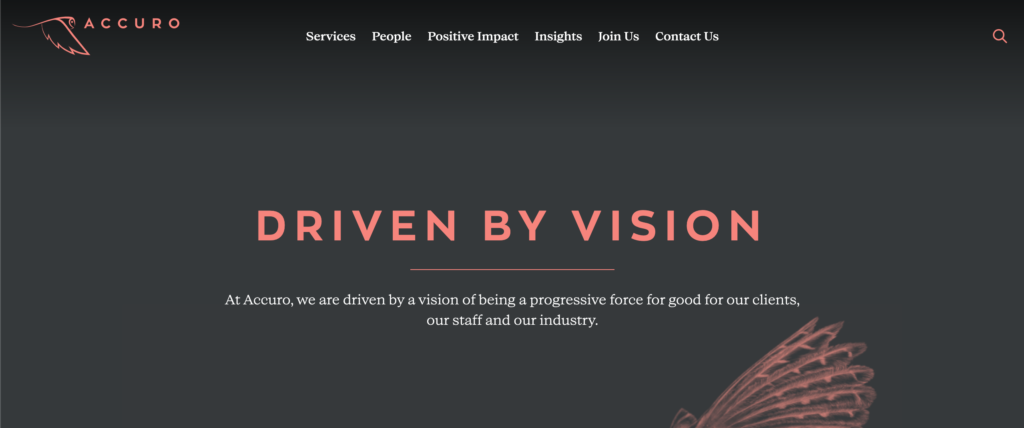
Jersey-based trust management company Accuro operates in the private wealth sector, and focuses its value to families, local businesses and entrepreneurs in an effectively concise site experience. Clad in its distinctive colour scheme and owl illustrations, the homepage places emphasis on their brand strategy and commitment to clients to give their digital platform a wholly personally brand. That extends to its simple navigation, highlighting its team on the ‘people’ page, and showcasing an insights landing page that houses written and video content based on money management and positive impact, where users can subscribe to email updates.
ARK Invest
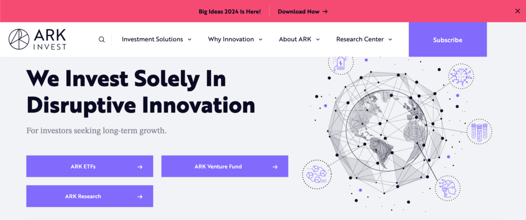
When it comes to investment or asset managers, their webpage visitors will be keen to discover investment strategies and fund ranges first and foremost. Fittingly, ARK Invest – focusing on ‘disruptive innovation in the public equity markets’ – place their investment process upfront on its homepage with links to individual funds, the pages of which contain a multitude of information from performance graphs to video to fund commentaries and FAQs. The electric purple look and feel extends from icons to graphics to inviting CTAs, drives the disruptive ethos home through digital design and functionality.
Cleo
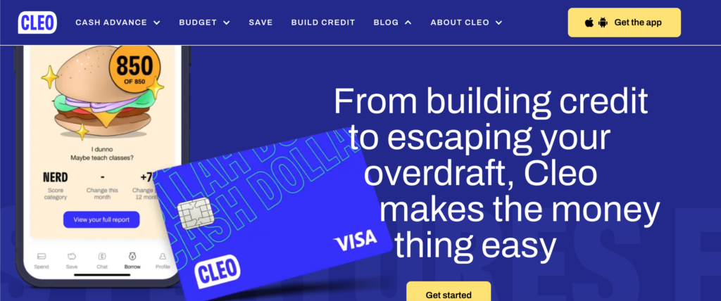
Making money matter for younger people is a tough burgeoning market and Cleo’s unconventionally brash and in-your-face website gets right down to business. It’s certainly an unforgettable experience, utilising slang terms, emojis, animation and pizza cursors, as well as highly actionable copy in its navigation that entices users with services centred on ways to budget, save, borrow and build credit. It’s designed with younger clients in mind: linking to a free trial immediately, and using a QR code to download the app. The imagery may only pertain to a certain market, but its fresh UX extends to a highly browsable blog and still translates extremely well to mobile.
Heptagon Capital
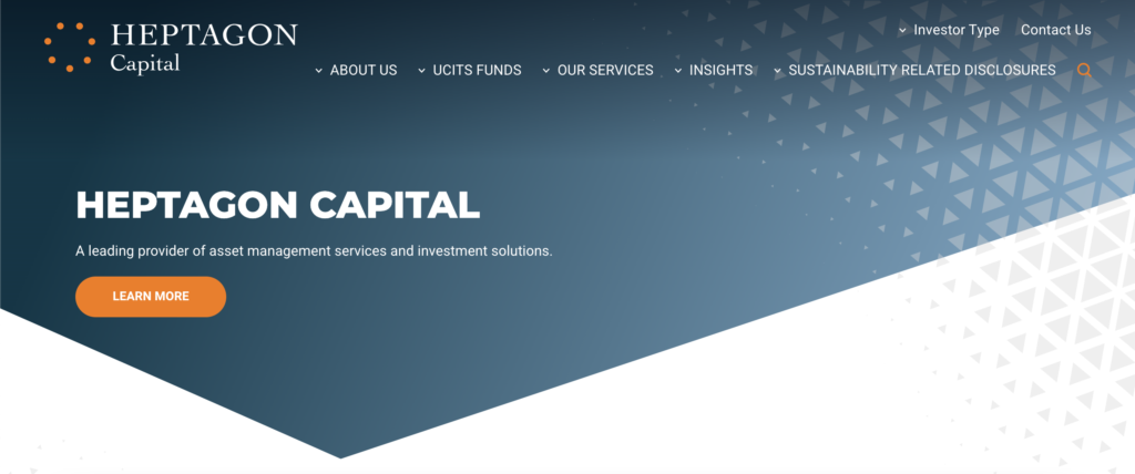
Some attestations for financial services websites can be clunky and wordy, but Heptagon Capital’s immediate preferences selector has UX front-of-mind, with fast button selections and a disclaimer all on one page to tailor content to users before getting started. The financial advisor places two main focuses on the site – their fund range and thought leadership snippets – both useful components for browsing investors who can discover the company’s releases, news and commentaries right next to their product range. The UCITS fund finder is great to explore using toggle filters, while similarly well segmented graphics adorn the insights page, making it easy for users to delve into the firm’s webcasts and outlooks.
Jensen Investment Management
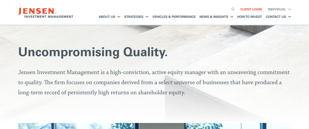
Jensen Investment Management’s small but mighty web offering is committed to content and carving a digital path for investors to find their way to what they’re looking for. Its homepage begins with a short insight video into their firm’s history, outlook and client-driven solutions, and focuses on their team-based investment style. It’s simple to browse the latest articles and videos, while reports and Jensen updates can also be subscribed to within an intuitive footer. The dropdown top toolbar is also easy to follow for fund finders, insights centres and contact pages.
Monzo
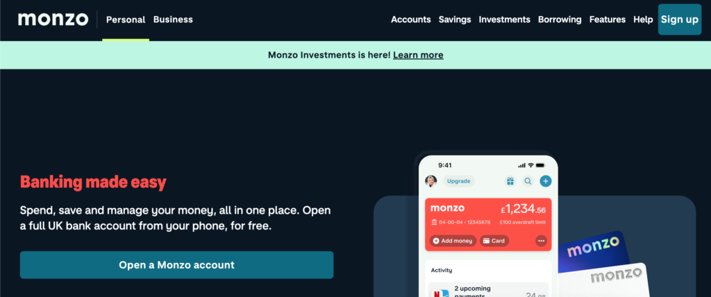
Beginning as a startup renowned for its ‘hot coral’ card, Monzo has branched out into becoming a full-on bank. Its website, clad in its other distinctive hues, breezes through its range of services, all featured in the top toolbar from account types to saving to borrowing. With a heavy focus on its award-winning app, it’s not just easy to download following bold app store CTAs, but every graphic displays its interface in action, nestling screengrabs inside mobile vector images. Its extensive homepage houses all the necessary information a web user needs, arranged in colourful blocks to distinguish its range of features.
Morgan Stanley
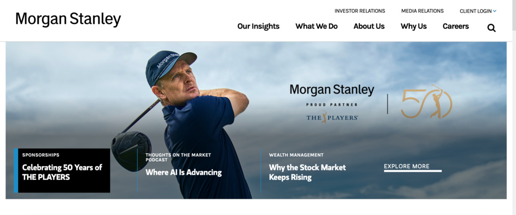
Favouring a clean block format works well for the site offering from Morgan Stanley, whose white space makes every homepage module feel worth checking out. Immediate a web user can toggle through striking graphics accentuating their latest insights pages, and content plays a huge part in the whole web experience. Informative video, content carousels, and email newsletter signups all drive action while their customer-first strategies are fitted into an extensive top toolbar that contains all the information someone needs to explore their own financial goals.
Nordea
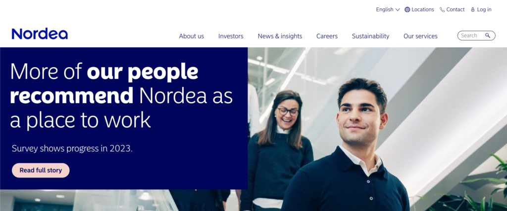
Nordic bank Nordea’s pink, blue and white look and feel lends itself well to an easy-to-use, free flowing web offering. It’s dropdown toolbar expands from left to right according to what you’re searching for, be it financial reports, sustainability policies, or podcasts. A nimble scroll down the homepage reveals more well positioned insight articles to browse through, stock exchange information, and a comprehensive block footer with links covering the whole site and social media buttons. With all the navigation available on one page, it’s surprisingly spacious and uncluttered, placing insights and strategy at the forefront.
Stripe
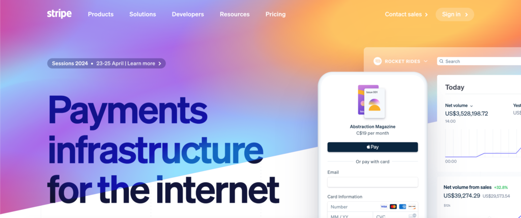
Stripe’s website is a leading example of making fintech look high tech through design. It’s striking gradient patterns and irregular shapes make each module flow together, despite its heady mixture of animated graphics for developers and moving icons. Similarly striking images make the toolbar fun to flick through, and colourfully points multiple users toward industry types and an extensive product suite. It’s cutting-edge app store look and feel and bold partnership logos are excellent for creating trust, while a language toggle button in the (very kitted-out) footer provides great UX for its audience across the world.
Tranch
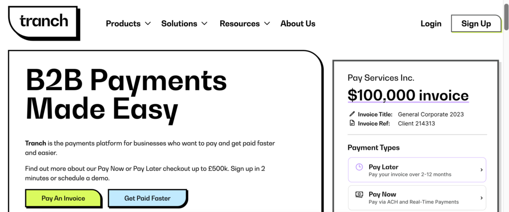
Offering a zany, modern and eye-catching concept is checkout platform Tranch. It’s monochrome logo shape defines each section, explaining its collection of services and features for B2B companies, but works to break up the small one-pager into distinct bite sized moments. It’s ‘payments made easy’ slogan is well represented in its design, which ditches interactive popups or animations for clear, concise and colourful buttons to guide the user along. It’s FAQ section makes great use of collapsible menus according to themes, and the interactive product options supply a handy way of instigating a customer journey. Capturing no nonsense copy and crisp vector graphics, it’s a captivating package aiming to drive users toward the sign up option.
Using design smarts to best present services and solutions is obvious across every sub-sector of the financial industry. No matter if a site is used to showcase smaller tools pertaining to personal finances or payments, or large institutions offering a wide range of funds and investment opportunities, developing a secure, fast and sleek webpage is a great way to suit the needs of any buyer along their digital journey.
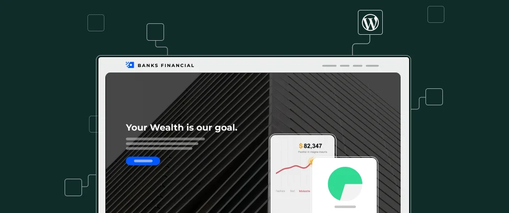
If you’re feeling inspired by the above examples to host a performant secure WordPress site built by experienced developers, talk to the SiteBox team to book a demo today.