The software as a service (SaaS) field is a stacked one.
SaaS products can exist as simple and effective tools for easy implementation, or large-scale end-to-end platforms aiming to make every part of a company’s life easier. But with their B2B audiences usually steeped in the ins-and-outs of technical know-how, their websites have to stand out and drive users toward the information they need: how the software works, how it can help them, where to find insightful content, and much more.
With multiple builders out there for agencies, marketers and designers to spin up attractive, functional and mobile responsive sites far more quickly these days, here are some inspiring SaaS websites that put the user experience front of mind while looking great in the process.
Butter
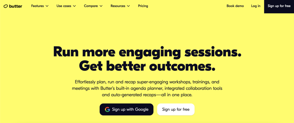
Starting off with a flash of colour, Butter is on a mission to make work meetings, training workshops and meetings more engaging through its playful, buttery colour scheme. Committed to its brand, the imagery is bold, brash and cartoonish in pastel hues, yet laid out neatly for a great surfing experience through to its pinpoint calls to action. Hand-drawn icons make their top toolbar fun to browse, where you can easily find downloadable templates and graphics to start using their in-house designed products. Even the pricing and FAQs page balances humour with information; it’s a top example of trickling tone and style throughout every webpage, all the way down to the copy and functionality.
Clickup
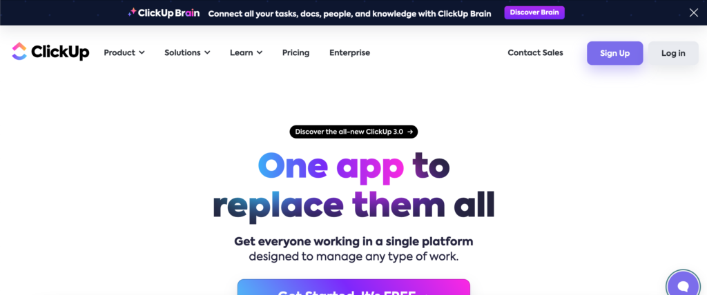
Interactivity is the name of the game for workflow collaboration software Clickup, which leans into its USP on being a ‘complete app solution’. Users can sign up for free on first sight using email or find out more information from its non-intrusive chatbot pop up. The homepage is constructed from succinct feature-focused interactive widgets which guide browsers to their intended destinations around the whole site, while comparing their own features to similar companies. Each of those comparison pages are located in a kitted-out footer offering the ability to download the software through various app stores. Similarly easy to navigate is its top toolbar, noteworthy for its ‘Learn’ section including demos, tutorials and ‘Clickup University’ courses.
Decodable
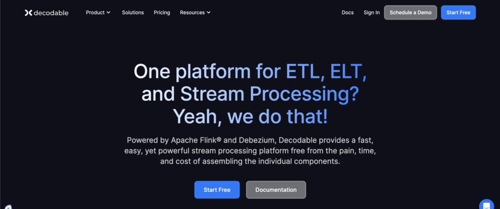
Knowing your intended audience feels like a given when constructing a site, but it’s tough to be consistent. Stream processing platform Decodable does a respectable job making itself familiar to developers, from visually striking introduction videos, technical copy, an immediate CTA taking users to a Documentation page (fitted with a large-scale search library and Community Slack link), and its homepage being painted in a sleek dark mode setting. Its navigation sums up ‘less is more’, allowing users to discover solutions by use case or access tagged resources with ease from collapsible dropdown lists. Aiming to get users production-ready in minutes, this SaaS site does a great job of outlining the integrations and features developers will need to know about upfront.
Dropbox
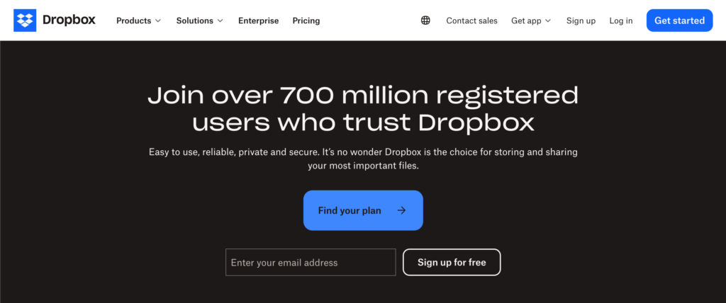
Dropbox is an established file storing platform, and their site is also renowned for its bold and unusual typeface. The immediate buttons are clear to help a visitor find the right Dropbox plan for their personal or work use while the rest of the site showcases the platform’s range of integrations with popular providers including Zoom, Adobe Creative Cloud or Microsoft Office. Knowing that security is Dropbox’s main draw for users, the site leans heavily on customer testimonials and cloud storage features, while additional products are laid out in a slick icon-first list structure in the top toolbar. The navigation is also static, remaining in place while you scroll down the page for constant access.
Figma
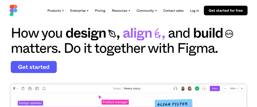
Web builders may be familiar with Figma – the software that helps colleagues collectively visualise designs and workflows in one place. In that light, visuals play a major role on its homepage. Splatters of yellow, green and blue vibrantly showcase a whole project being undertaken while you scroll down, exploring their design systems, prototyping and dev mode features as a fun and educational web experience with the same look (and cursor!) as the platform itself. Built by designers with other designers in mind, the graphics are striking everywhere and the copy is fresh, while its community hub provides free and paid-for plugins and templates to inspire UX research, wireframes, notes and whiteboards.
Notion
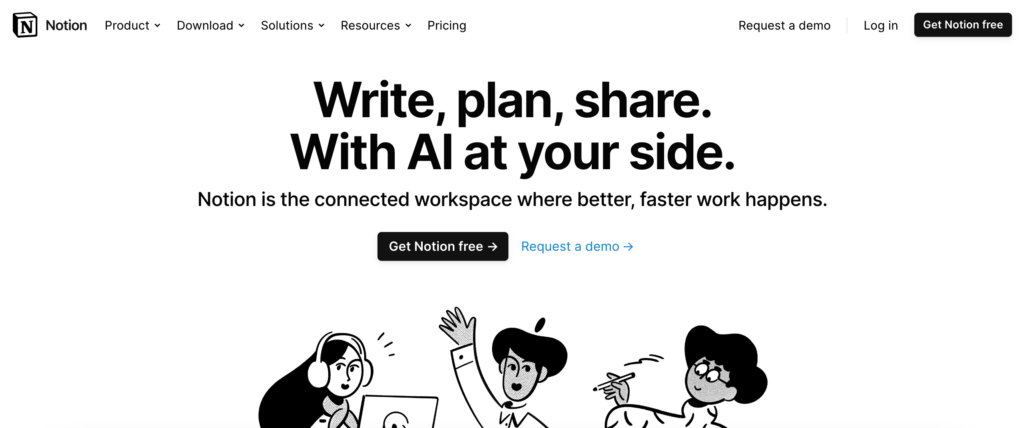
Abuzz with cool icons and a neat (mostly) monochrome look, the site for connected workspace platform Notion translates its intention of being a well organised space to its UX. Rather than going too glossy with pop outs or interactive features, icons supply the necessary look, colour-coded to enticing buttons leading users to its product suite best related to their own job functions. The muted screengrabs show the product in action to get a real-time feel for the project tools, while its functional blog and resource libraries are similarly well-presented and tagged appropriately to facilitate learning. Another notable module is its AI add-on module, which leads users to related Q&As, and a vibrant landing page to demo how the hot-topic technology works.
Nowsta
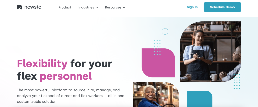
The power of a simple interface is exemplified in the web design for workforce management platform Nowsta. Its main value drivers are all present in a bold feature image, complete with the logo’s geometric shape scattered throughout the site to charge brand identity. While immediately familiar with who they are and what they do, its navigation only needs three choices to lead the user to resources or attractive graphic-laden product pages. It’s easy to get to grips with Nowsta through a couple of selective CTAs: one to a demo form, and the other to a hiring link where users can submit a staff request from the homepage, displaying how this SaaS company uses its website to drive usage.
Segment
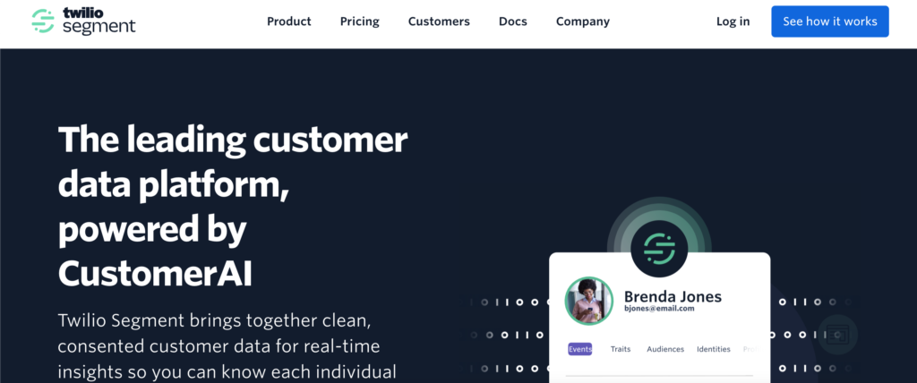
Marketers can make their website an excellent playground to house their content and drive conversions, and customer data platform Segment does exactly that. Users can book demos using an email input or create a free account straight away, while also able to register for the company’s latest event or download a newly published report. Also leaning into marketing advantages, Segment’s exploration module showcases how its platform visualises various customer data dashboards and instructional diagrams detail how the software works to gain intelligence. Segment’s toolbar also presents their products and solutions clearly according to industry, with clear links to documentation and API references for their data-centric audience.
Slack
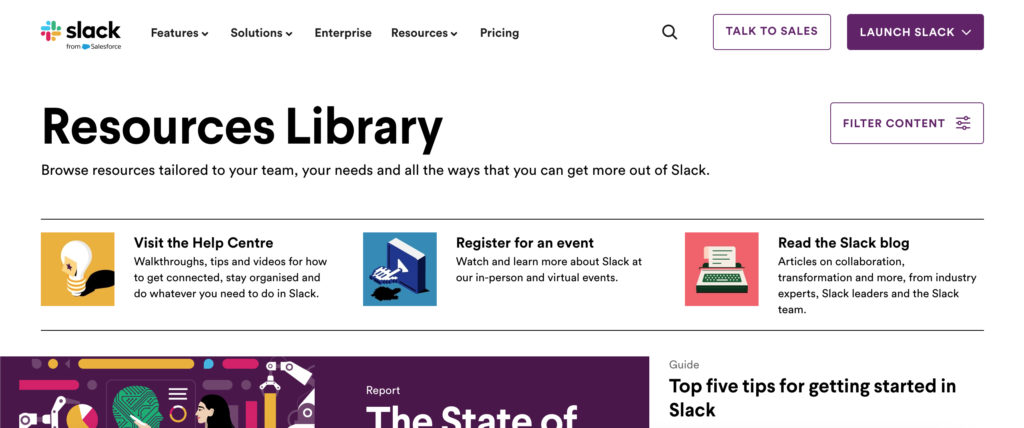
Slack is a popular ‘Space’ for colleagues to chat and collaborate, and it places existing users at the heart. Upon opening, you can instantly access their Slack workplace, or set up a new one, with straight-forward buttons to drive downloads and startup wizards that connect with Google and Apple email. Its search function remains static, offering recommended popular searches in a drop down, while short form features, integrations and solutions pages remain concise using block layouts and animated gifs to subtly link every part of its compact website. Its ‘paid vs free’ landing page helps users choose their correct plan right away with video explainers and options to upgrade later.
Zapier
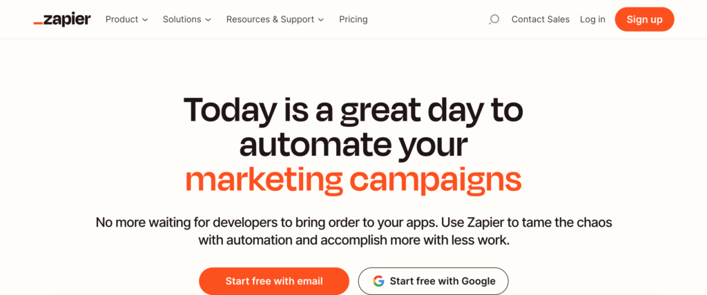
Zapier is all about connecting various workflow tools into a customisable automation platform, with a heavy emphasis on its huge library of integrations. It doesn’t take long to scroll down through the neat homepage and understand how the platform works, eventually leading to a powerful footer allowing users to browse their favourite apps alphabetically and by category. The navigation is high in UX design, concisely displaying the product’s main advantages, with upfront links to early access tools, a quick-start guide or more advanced developer tools for experienced customers. Keen to drive productivity, it’s resource centre also allows for email subscriptions and ‘app of the day’ recommendations.
Crafting an intuitive interface with interactive widgets and resources aplenty, SaaS companies lead the way in user-centric design, aware that customers want to understand their solutions and experience key features, templates and documentation straight away, while keeping their websites streamlined to bring every page together.
Building world-class digital website experiences no longer takes months to complete. If you’re feeling inspired by the above examples to host a performant secure WordPress site built by experienced developers, talk to the SiteBox team today to book a demo.